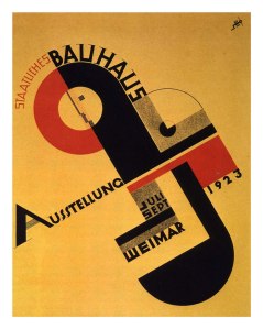
Raoul Hausmann (Dada)

Raoul Hausmann was an Austrian artist and writer. One of the key figures in Berlin Dada, his experimental photographic collages, sound poetry and institutional critiques would have a profound influence on the European Avant-Garde in the aftermath of World War I.

Raoul Hausmann was born in Vienna but moved to Berlin with his parents at the age of 14, in 1901. His earliest art training was from his father, a professional conservator and painter. He met Johannes Baader, an eccentric architect and another future member of Dada, in 1905. At around the same time he met Elfride Schaeffer, a violinist, whom he married in 1908, a year after the birth of their daughter, Vera. That same year Hausmann enrolled at a private Art School in Berlin, where he remained until 1911.After seeing Expressionist paintings in Herwarth Walden’s gallery Der Sturm in 1912, Hausmann started to produce Expressionist prints in Erich Heckel’s studio and became a staff writer for Walden’s magazine, also called Der Sturm, which provided a platform for his earliest polemical writings against the art establishment. In keeping with his Expressionist colleagues, he initially welcomed the war, believing it to be a necessary cleansing of a calcified society, although being an Austrian citizen living in Germany he was spared the draft. Hausmann met Hannah Höch in 1915, and embarked upon an extramarital affair that produced an ‘artistically productive but turbulent bond’ that would last until 1922. In 1916 Hausmann met two more people who would become important influences on his subsequent career; the psychoanalyst Otto Gross who believed psychoanalysis to be the preparation for revolution, and the anarchist writer Franz Jung. By now his artistic circle had come to include the writer Salomo Friedlaender, Hans Richter, Emmy Hennings and members of Die Aktion magazine, which, along with Der Sturm and the anarchist paper Die Freie Straße published numerous articles by him in this period.

Image

Hannah Höch (Dada)

Hannah Höch was a German Dada artist. She is best known for her work of theWeimar period, when she was one of the originators of photomontage. She studied at the College of Arts and Crafts in Berlin under the guidance of Harold Bergen. She chose the curriculum glass design and graphic arts, rather than fine arts to please her father. In 1914, at the start of World War I she left the school to work with the Red Cross. In 1915 she returned to school, entering the graphics class of the National Institute of the Museum of Arts and Crafts. Also in 1915, Höch began an influential friendship with Raoul Hausmann, a member of the Berlin Dada movement. Höch’s involvement with the Berlin Dadaists began in earnest in 1919. After her schooling, she worked in the handicrafts department for Ullstein Verlag (The Ullstein Press), designing dress and embroidery patterns for Die Dame (The Lady) and Die Praktische Berlinerin (The Practical Berlin Woman). From 1926 to 1929 she lived and worked in the Netherlands. Höch made many influential friendships over the years, with Kurt Schwitters and Piet Mondrian among others. Höch, along with Hausmann, was one of the first pioneers of the art form that would come to be known as photomontage. Höch was a pioneer of the art form that became known as photomontage. Many of her pieces sardonically critique the mass culture beauty industry, at the time gaining significant momentum in mass media through the rise of fashion and advertising photography. Her works from 1926 to 1935 often depicted same sex couples, and women were once again a central theme in her work from 1963 to 1973. Höch also made strong statements on racial discrimination. Her most famous piece is Schnitt mit dem Küchenmesser DADA durch die letzte weimarer Bierbauchkulturepoche Deutschlands (“Cut with the Dada Kitchen Knife through the Last Weimar Beer-Belly Cultural Epoch in Germany”), a critique of Weimar Germany in 1919. This piece combines images from newspapers of the time re-created to make a new statement about life and art in the Dada movement.

Image

Image

Bauhaus research

Bauhaus, was a school in Germany that combined crafts and the fine arts and was famous for the approach to design that it publicized and taught. It operated from 1919 to 1933. At that time the German term Bauhaus literally “house of construction”, stood for “School of Building”.

The Bauhaus school was founded by Walter Gropius in Weimar. In spite of its name and the fact that its founder was an architect, the Bauhaus did not have an architecture department during the first years of its existence. Nonetheless it was founded with the idea of creating a “total” work of art in which all arts, including architecture, would eventually be brought together. The Bauhaus style became one of the most influential currents in Modernist architecture and modern design. The Bauhaus had a profound influence upon subsequent developments in art, architecture, graphic design, interior design, industrial design, and typography. The school existed in three German cities: Weimar from 1919 to 1925, Dessau from 1925 to 1932 and Berlin from 1932 to 1933), under three different architect-directors: Walter Gropius from 1919 to 1928, Hannes Meyer from 1928 to 1930 and Ludwig Mies van der Rohefrom 1930 until 1933, when the school was closed by its own leadership under pressure from the Nazi regime. The Nazi government claimed that it was a centre of communist intellectualism. Though the school was closed, the staff continued to spread its idealistic precepts as they left Germany and emigrated all over the world. The changes of venue and leadership resulted in a constant shifting of focus, technique, instructors, and politics. For instance: the pottery shop was discontinued when the school moved from Weimar to Dessau, even though it had been an important revenue source; when Mies van der Rohe took over the school in 1930, he transformed it into a private school, and would not allow any supporters of Hannes Meyer to attend it. The typography workshop, while not initially a priority of the Bauhaus, became increasingly important under figures like Moholy-Nagy and the graphic designer Herbert Bayer at the Bauhaus, typography was conceived as both an empirical means of communication and an artistic expression, with visual clarity stressed above all. Concurrently, typography became increasingly connected to corporate identity and advertising. The promotional materials prepared for the Bauhaus at the workshop, with their use of sans serif typefaces and the incorporation of photography as a key graphic element, served as visual symbols of the avant-garde institution. 

Its core objective was a radical concept: to re-imagine the material world to reflect the unity of all the arts. Gropius explained this vision for a union of art and design in the Proclamation of the Bauhaus (1919), which described a utopian craft guild combining architecture, sculpture, and painting into a single creative expression. Gropius developed a craft-based curriculum that would turn out artisans and designers capable of creating useful and beautiful objects appropriate to this new system of living. 

Image

Dada Research

Dada was an informal international movement, with participants in Europe and North America. The beginnings of Dada correspond to the outbreak of World War I. For many participants, the movement was a protest against the bourgeois nationalist and colonialist interests, which many Dadaists believed were the root cause of the war, and against the cultural and intellectual conformity—in art and more broadly in society that corresponded to the war.

Many Dadaists believed that the ‘reason’ and ‘logic’ of bourgeois capitalist society had led people into war. They expressed their rejection of that ideology in artistic expression that appeared to reject logic and embrace chaos and irrationality. For example, George Grosz later recalled that his Dadaist art was intended as a protest “against this world of mutual destruction.” According to Hans Richter, Dada was not art, it was “anti-art.” Everything for which art stood, Dada represented the opposite. Where art was concerned with traditional aesthetics, Dada ignored aesthetics. If art was to appeal to sensibilities, Dada was intended to offend. As Hugo Ball expressed it “For us, art is not an end in itself … but it is an opportunity for the true perception and criticism of the times we live in.” A reviewer from the American Art News stated at the time that “Dada philosophy is the sickest, most paralyzing and most destructive thing that has ever originated from the brain of man.” Art historians have described Dada as being, in large part, a “reaction to what many of these artists saw as nothing more than an insane spectacle of collective homicide.” Years later, Dada artists described the movement as “a phenomenon bursting forth in the midst of the postwar economic and moral crisis, a savior, a monster, which would lay waste to everything in its path (It was) a systematic work of destruction and demoralization… In the end it became nothing but an act of sacrilege.”

Key Characteristics of Dada Art:

  • Dada began in Zurich and became an international movement. Or non-movement, as it were.
  • Dada had only one rule: Never follow any known rules.
  • Dada was intended to provoke an emotional reaction from the viewer (typically shock or outrage). If its art failed to offend traditionalists, Dada writing — particularly Tristan Tzara’s manifestos — proved a fine, nose-thumbing Plan B.
  • Dada art is nonsensical to the point of whimsy. Almost all of the people who created it were ferociously serious, though.
  • Abstraction and Expressionism were the main influences on Dada, followed by Cubismand, to a lesser extent, Futurism.
  • There was no predominant medium in Dadaist art. All things from geometric tapestries to glass to plaster and wooden reliefs were fair game. It’s worth noting, though, that assemblage, collage, photo-montage and the use of ready made objects all gained wide acceptance due to their use in Dada art.
  • For something that supposedly meant nothing, Dada certainly created a lot of offshoots. In addition to spawning numerous literary journals, Dada influenced many concurrent trends in the visual arts (especially in the case of Constructivism). The best-known movement Dada was directly responsible for is Surrealism.
  • Dada self-destructed when it was in danger of becoming “acceptable”.

Image

Image

Joost Schmidt (Bauhaus)


Joost Schmidt was a teacher or master at the Bauhaus and later a professor at the College of Visual Arts, Berlin. He was a visionary typographer and graphic designer who is best known for designing the famous poster for the 1923 Bauhaus Exhibition in Weimar, Germany.

bauhaus Joostt schmidtBauhaus Exhibition Poster 1923

The Bauhaus School was born from the angst of World War I and ugliness of the industrialized society that had brought Europe to that point.  Its goal was to recognize and unify the commonality of the fine arts and the applied arts.  The Bauhaus School worked to elevate standards of design and public taste through excellence in design and craftsmanship.
This particular piece was designed by Joost Schmidt for the Bauhaus Exhibition of 1923.  This piece reflects on of the many “shifts” of the teaching philosophy at the Bauhaus School from “Art meets Craft” to “Art meets Machine.”  This was a natural, if not controversial within the school, step for the Bauhaus during the industrialization on the early 1900’s. This early modern work uses geometric shapes and machine forms to showcase the innovative work done at the Bauhaus.  You can see influence of other types of art from the period in the piece, cubism, constructivism, Di Stijl which also reflect the principles of the school, to take diverse styles and meld them into new design approaches.  The high contrast color scheme creates drama and intensity in poster.  The repetition of circles, textures (solids, pavement-like surface, lines, and mesh), color, and typeface all create unity in this work.   The typefaces is square-shaped with no curves except for the Ausstellung and 1923. The text is placed perfectly to guide the eye through the work.  The face is the “seal” of Bauhaus and signifies how man meets machine.  I like the tilting  and angles of the poster; it, creates a sense of imbalance.

Joost Schmidt began his studies in 1910 at the Großherzoglich-Sächsische Hochschule für bildende Kunst (Grand Ducal Saxonian school of arts) in Weimar and subsequently became a master student of Max Thedy. In the winter semester of 1913/14, he received his diploma in painting. After military service and a period as a prisoner of war, he returned to Germany in 1918. He then took up another course of studies at the Staatliches Bauhaus Weimar. From 1919 to 1924/25, he trained in the workshop for stone and wood sculpture under Johannes Itten and Oskar Schlemmer. In 1921/22, his projects included the design and completion of carvings for the Sommerfeld House in Berlin and the design of a poster for the Bauhaus exhibition of 1923 in Weimar. He also developed a pantomime for this event, which was performed at the municipal theatre in Jena. His involvement in theatre was to lead in 1925 to his design for a mechanical stage. In 1925, having signed an option with Otto Bartning, the director of the Staatliche Bauhochschule Weimar (state school of architecture Weimar) who had planned to employ him as head of the sculpture workshop and head of the sculpture workshop and typographic department, Schmidt instead accepted an offer from Walter Gropius to become a junior master at the Bauhaus Dessau after passing the journeyman’s examination of the Chamber of Crafts Weimar. That same year, Schmidt married the Bauhaus student Helene Nonné. At the Bauhaus Dessau, Joost taught calligraphy for thepreliminary course (1925 to 1932) and directed the sculpture workshop (1928–1930), and the advertising, typography and printing workshop and the affiliated photography department (1928–1932). From 1929 to 1930, he was also a life-drawing teacher, teaching life and figure drawing for the upper semesters from 1930. In addition, Joost Schmidt was responsible for the technical setup of the studio stage. Schmidt did not work at the Bauhaus Berlin. In 1934, in collaboration with Walter Gropius, Schmidt designed the “non-iron metals” section of the propaganda exhibition Deutsches Volk – Deutsche Arbeit (German people – German work). He opened a studio in Berlin in the same year and also worked as a draughtsman/illustrator of maps. In 1935, he accepted a teaching position at the private art school Kunst und Werk (formerly the Reimann-Schule), directed by Hugo Häring. However, he was soon prevented from practicing his profession due to his past affiliation with the Bauhaus. He subsequently worked as a typographer for the publishers Alfred Metzner Verlag and others. After the war, Max Taut appointed him as a professor at the Hochschule für bildende Künste (school of art) in Berlin where he took over the preliminary course for architects. In 1946, he collaborated with other members of the Bauhaus on the design of the exhibition Berlin plant/Erster Bericht, the first exhibition on the city’s plans for reconstruction, held in the Berlin City Palace. In 1947/48, he received an offer from the USA Exhibition Center to design exhibitions. Prior to his death in 1948, he was working on another Bauhaus exhibition and the publication of a Bauhaus book.

Jamie Ried (Dada)

james-reid-dada21

Jamie Reids’ work reflects the work of Dada. In Jamie Reids’ work he uses lots of photographs and manipulates them and changes them however he pleases. In the piece of work above he has used an image of the queen and placed an image of a safety pin over/through her mouth.This refers to having to keep your mouth shut and the lack of freedom of speech. This is very relevant to the French uprising as the students felt that were not being heard and also the Punk movement for it’s outspoken like ways.The punk ideology encouraged people to rebel and that there wasn’t a worry about the future because there was ‘no future for you’ (lyric from ‘God Save The Queen’ – Sex Pistols.) This outlook of having no future was stemmed by the lack of jobs and prospect for the younger generation in Britain around the time punk broke in the late 1970s, where strikes from the mines, postal and bin services became the norm. The way that Jamie Reid defaces the Queen was considered very outrageous and a large percentage of the British public were disgusted, especially as the record was released just in time for the Queens Silver Jubilee. It is very clear that Jamie Reid was somewhat influenced by Dada work and how Dadaists manipulated political figures and made politicians or high upper class people look powerless and defenseless in their work. In the work of Dadaists, they defaced many politicians and high authority figures and Jamie Reid also does this in his designs too.

punk-posters-001  jamie_reid_hate_duchamp1

Jamie Reid’s longstanding practice as an artist sits firmly within a tradition of English radical dissent that would include, for example, William Blake, Wat Tyler and Gerrard Winstanley. Like them, the work of dissent must offer, out of necessity, other social and spiritual models and Reid’s practice is no exception. Although Reid is known primarily for the deployment of Situationist strategies in his iconic work for the Sex Pistols and Suburban Press, the manifold strands of his art both continue that work whilst showing us other ways in which we can mobilise our energy and spirituality. It is this dialectic between gnosticism and dissent that lies at the heart of Reid’s practice and makes him one of the great English iconoclastic artists. Jamie Reid’s unique vision articulates and gives form to some of the key issues of our times. He responds to the ever-increasing attacks on our civil liberties and shared common spaces with passionate anger and savage humour, and shows us ways in which we might re-organise our political and spiritual resources. This is the role of the shaman and Reid’s art acts like a lightning rod, returning us to the earth so that we might share the work of healing. In 1997 I was asked to organise a full scale retrospective of Jamie Reid’s work in New York City. I’d never met Jamie before and as we started to get things together it quickly struck me how this was a man of conviction and wisdom, possessing a wide breadth of knowledge that encompassed social politics, esoteric sprirituality, astronomy, free jazz and Fulham FC. It was also immediately clear that this was a man who relished a collaboration – seeing what happened when the rein was loosened. That first exhibition was called Peace Is Tough. Over the years we have met in various parts of the world and Jamie has always charmed me with his modesty, honesty, integrety and talent. Of course he is notorious for his work with the Sex Pistols in the mid to late-seventies, but there is so much more than this. His work with the Suburban Press was an early coalescing of his political drive and artistic ‘nous’ and work after the inmplosion of the Pistols extended his artistic drive through many genres – music, publishing, performance. His work is a spectrum with many unseen hues and it is our pleasure to journey through these works in presenting and safeguarding the Jamie Reid Archive. After a ten year installation period with the Strongroom Studios in Shoreditch he is now immersed in discovering and revealing the Aspects of the Eightfold Year.


Bauhaus Poster


Bauhaus Poster

Image This was my first poster I made in the style of Bauhaus. The poster beneath by Joost Schmidt influenced me. I wanted to make my poster more modern and up-to-date so I decided to use different colours from what Bauhaus artists usually used. I wanted to reflect how Bauhaus artists usually produced work on an angle and with the text warped/distorted around a circle shape.

bauhaus Joostt schmidt 
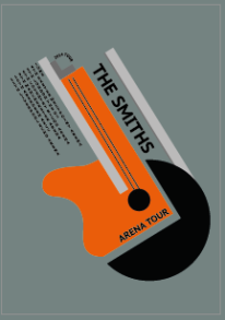
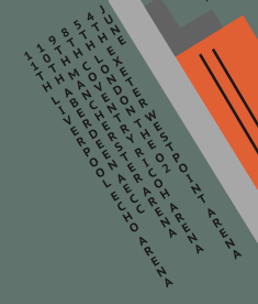
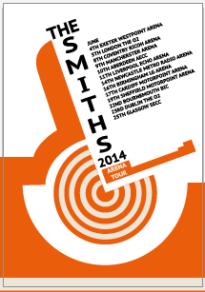
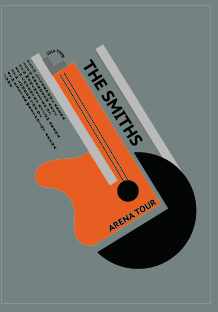
My idea for a Bauhaus poster was to do a tour poster for ‘The Smiths’. I figured this would be an effective and creative design to produce in the style of Bauhaus. I knew about The Smiths already and knew that there guitarist Johnny Marr was quite an iconic figure for the band. So I took this element on board and decided I would create a guitar shape using other little shapes that were broken apart to overall create the shape of the guitar. I found out that a lot of Bauhaus style posters reminded me of industrial elements such as the pipes ad funnels where the smoke would leave and they were very plain and geometric. Also they were usually only one or two colours with lots of white space. The typography they used was very rounded, lowercase and bold but in some cases they used uppercase letters, which had more of an impact. I created my poster with the idea that it would put up on walls and in places/arenas to get the targeted audience. I made my poster A3 for this reason so the small text would be able to be read from a distance and entice the viewer. I created my whole poster in Illustrator. I used the pen tool and shape tool to create the basis of my design. I thought I’d reflect an element of industrial in my design like original Bauhaus posters so next to the strings of the guitar, I added a grey rectangle to resemble a basic funnel of factories etc. I also added another grey rectangle above the text ‘The Smiths’ so show some symmetry in the design and to clear some of the white space, which was too much. In the poster I based my own poster off they have used lots of basic shapes, such as the grey shape below:

Screen Shot 2014-02-04 at 14.16.33  I wanted to use this in my design to reflect some more elements of original Bauhaus posters so I made two rectangles and made them a slightly darker grey than the other two rectangles, that resembles funnels, and placed these rectangles on top of my guitar shape above the guitar strings. I also wanted to reflect how in the original design there was a thin line warped around the grey shape creating a semi circle kind of line, so I decided instead of a line in my design, I would warp text and so I did:

Screen Shot 2014-02-04 at 14.20.39 
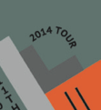
The text I decided on was ‘2014 Tour’. I first used the pen tool to draw myself a path above the two rectangles and then using the ‘type on path’ tool I wrote the text. For the typeface I decided to stick with the uppercase, like in the original poster. I used an existing font in the font book called ‘PT Sans Caption in bold’. I thought this font would be effective to represent Bauhaus as it was bold and sans serif. For a tour poster, you need tour dates so I thought since this was an arena tour, I would put dates and names of arenas on my poster to show where The Smiths would be preforming. I put the text on an angle, the same angle as all the shapes, and I also centred the text. The text was also vertical and not horizontal as on many Bauhaus posters, the text vertical.

Screen Shot 2014-02-04 at 14.22.44

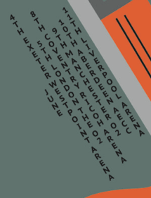
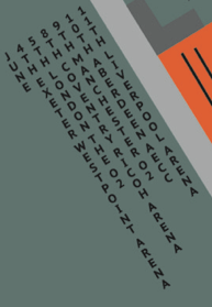
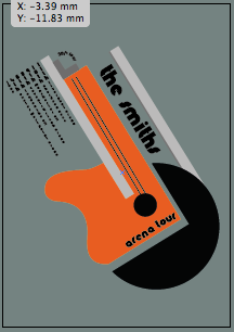
I decided to develop from my first poster design and create some further designs, as I was not entirely happy with my design or typography. This was my second poster I made which is just a replica of the first poster, only I changed the layout of the tour dates. I thought changing the way the text is aligned would make the design flow better and look more even/symmetric. This time I decided to align the text to the left but I changed how the text starts at each side. In my previous design, I had the text starting from the left and reading over to the right, but in my second poster I made it so that the text reads from the right to the left.

Image Screen Shot 2014-02-04 at 14.31.47

Again for more development I changed the layout of the text once again. Similar to my previous poster, the text was aligned left and it is aligned left in this poster too. To be different from my previous design I changed where the text started so in this poster the text reads from the left to the right, which is conventionally how readers would read things and it is much easier to read and follow.

Image Screen Shot 2014-02-04 at 14.39.02

For more development to this design, I created another poster with a completely different typeface from the past versions. I decided that I would try out lowercase letters and a font more in the style of Bauhaus. I downloaded a font from Dafont.com called ‘Knuckle Down Regular’. With the new font I changed all the text on my poster to be this font. I decided to stick with the layout of the tour dates similar to poster 3 so that the text was aligned left and read left to right.

Image Screen Shot 2014-02-05 at 11.24.29

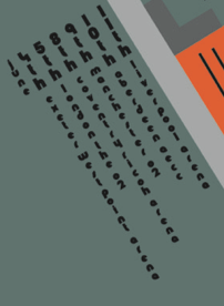
When I changed the typeface of these tour dates, I looked at original Bauhaus poster and noticed they made numbers larger than text itself so the number stood out, so I chose to do this on my poster and I made the dates of the tour dates exceedingly larger than the venues so the numbers were the first things that caught your eye.

I created a different design after developing various designs from my first initial design so I had a choice of two overall designs. My final design was based off the image below that I found on the internet:

AG_Ideas_Poster___Bauhaus_esq_by_MatthewDJones Image

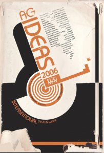
I noticed that this poster was very different from that of Joost Schmidt. I was unable to find an artist for this poster but I did find out that it was a modern Bauhaus style poster. I wanted to re-create this poster in my design so I decided I would continue with the idea of a tour poster for ‘The Smiths’. I started by using the circle shape tool and creating 9 circles and coloured them alternatively so it was orange, beige, orange, beige etc. I then drew a square using the shape tool and using pathfinder I cut out the square from each of the circles leaving me with this shape:

Screen Shot 2014-02-05 at 11.27.20 Screen Shot 2014-02-05 at 11.27.08

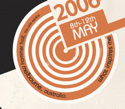
I also wanted to re-create the shape surrounding the cut-out circles so I drew, using the pen tool, around the curved rectangle parts of this shape and then I used the circle shape tool to make a circle and then subtracted it from a rectangle to give me the second part of the overall shape. For the typography of this design I chose to use the same typeface as my first poster design. I also made all the text at an angle to flow with the design.


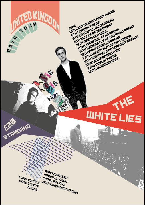
Overall my favourite design is this one:

Screen Shot 2014-01-28 at 13.35.17

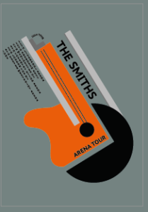
I thought that I interpreted the style of Bauhaus very well as I used very basic shapes and stuck to the geometric feel. I also stuck to only using two colours on my design. I chose to change and modify the colours from the original poster because I wanted to make my poster modern and not a replica of past/old/retro designs. I also wanted to make it my own too. I think the shape of the guitar works very well for a music tour poster because it represents music very effectively and even if the audience didn’t get that it was a guitar straight away, it would have to study my poster more, taking in all the other information. On a negative note I think I did miss out some essential information on my poster, such as; the price, where to buy the tickets and maybe a website to the band or a ticket merchandiser. Some reviews from people in my class helped with the development of my design and aided to the overall outcome. When other people saw my design they said that they could tell it was a guitar straight away and that they could see the industrial elements in it. From my first design I got comments such as to change the alignment of the tour dates, which I did in my development. I took the comments on board throughout my design process.


Russian Constructivism poster

Poster 1/2

Image 
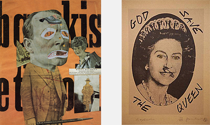
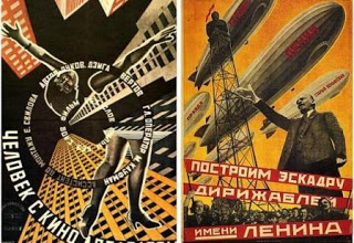
For my first poster design i was influence by the poster on the left. The poster on the left was by the Stenherg Brothers. I liked how the artists used an image of a woman but they distorted it quite a lot to create an unusual image. I also like how the text was set out on the poster in a kind of spinning formation.

Image For my first poster and second poster I used an image of a guitar I found on the internet and then I used the live trace tool in Illustrator to make it into vector like shape and so I could alter it. I then used the shear tool to make it kind of skewered and  like it was tilted towards something. This would create the vanishing point element of my Russian Constructivism.

Image This screenshot shows how I am altering the guitar and using the sheer tool to skewer it.

Image I then used the rotate tool and rotated it around 20degrees and then I used the transform again tool to copy the guitar. I ended up with 6 guitars in a spinning-like formation. This created a vanishing/focal point on my poster. I laid these guitars on top of one another and each one was rotated a different way and so it created a vanishing point/focal point at the corner of the poster. I decided to make the background a teal kinda blue/turquoise colour to make the other elements on the poster to stand out. I created the black bands/ribbons where the text is placed on using the pen tool to draw the one in the lower left corner. I drew a line with anchor points so I can curve it etc and then I just applied a thick stroke to the line. I created the other black circles in the middle using the circle shape tool and also applied a thick stroke to it. I used the type on path tool to add the text. The font I used was a font downloaded from Dafont.com called ‘Kremlin’ which I thought represented russian constructivism very well.

Image I developed from my first design from poster 1 and created a second poster. I decided to use the same guitar image however I placed them in a spiral formation creating a centre focal point in the middle of the poster.

Image

Image 
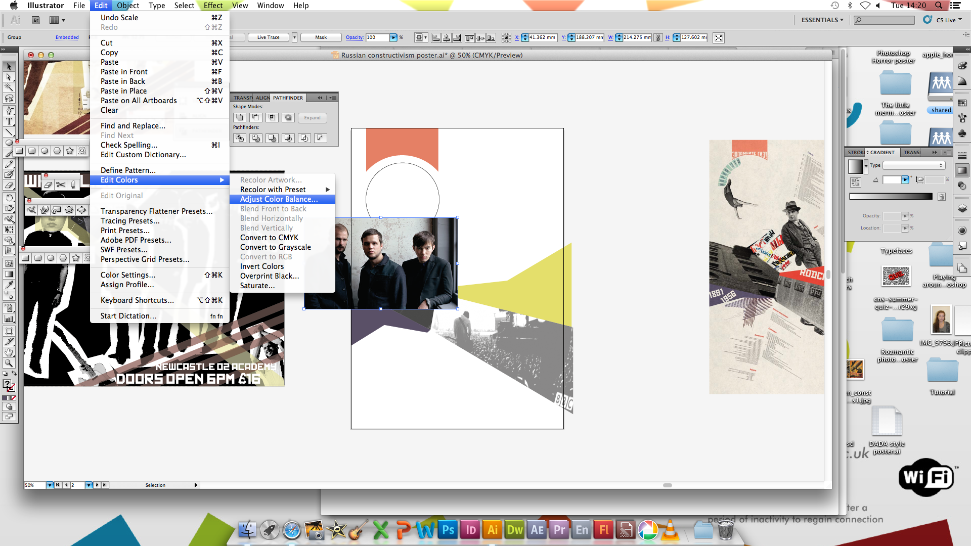
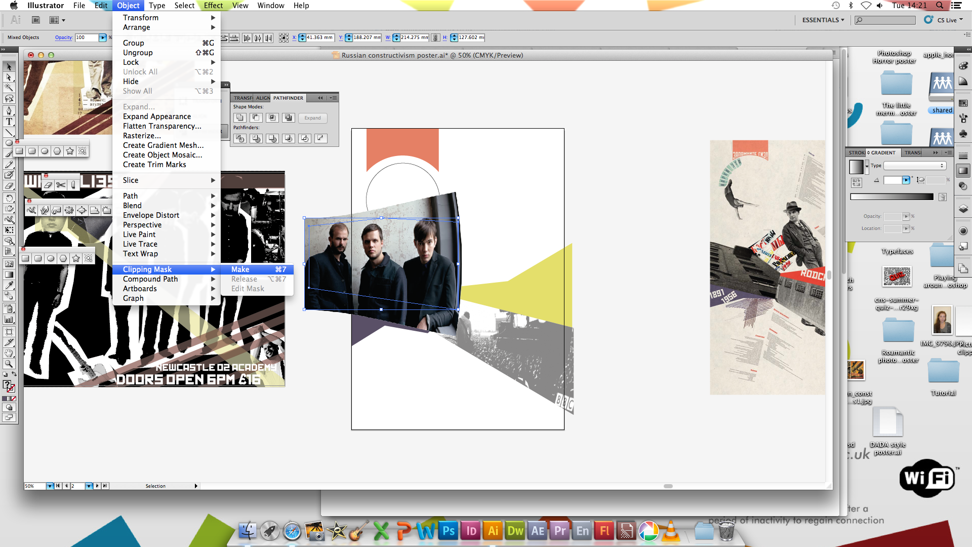
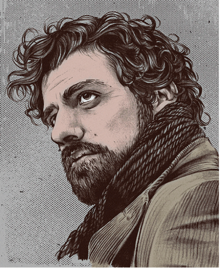
I then found this image on the internet which represented one of the band members of the band. I wanted this to be part of the focal point of the poster too, so using the shape too I created a circle over the image, which was the same size as the centre of the circle whcih the text is placed on, and then I created a clipping mask.

Poster 3

Image For my third film poster, I was inspired by the Stenherg Brothers. I found the top poster on the internet and decided I would create my own poster based off this.

Image I found images of the band and then I opened them in photshop where I would use the magic wand tool to delete the background or other objects on the image. I then used the lasso tool to go around them, leaving a white border around the image. I would then save the image as an eps so I could place it in my illustrator file.

Image Just like the poster I was inspired by, I wanted to use figures of people and use a repeat pattern and create some repetition and symmetry. I again got another image of the band and opened it in photoshop and repeated the steps I did before.

Image I edited the colours of the edited images and made all the images black and white to resemble ideal russian constructivism as many of the images were black and white or sepia. As you can see I made the heads of the band members larger than their bodies as in the Stenherg Brothers work, a lot of there photos were manipulated and they distorted the photos of people. I also positioned the band members in a repeat pattern with the lead band member/singer first. The poster has a very random layout and it also uses some basic geometrical shapes just like traditional Russian constructivism posters.

Overall I think this poster represents Russian constructivism very well as it shows lots of elements of the traditional Russian Constructivism work such as the geometric shapes, black and white images, distorted/manipulated images etc. I also think that this poster shows elements of Dada too.

Image

Poster 4

Image

Image

Image

Image

Image

Image

Image

Image

Image

Image

Image

Image

Image

Stenherg Brothers (Russian Constructivism)

In my Russian Constructivism work I used Stenherg Brothers’ work as an influence for my own design. I liked how in the Stenherg Brothers’ work they would use a lot of repetition and would create a lot of symmetry in their designs. Also in all their work, they would have a focal point in each design whether it be the center of the corners. Also in their designs they never had the text straight or centered. The text was always aligned left or right and either titled or warped around a shape. They used a lot of photographs, especially photographs from unusual angles which gave different perspectives. The images that are used are always sepia or gray scale.

They first studied engineering, then attended the Stroganov School of Applied Art in Moscow, 1912–17, and subsequently the Moscow Svomas (free studios), where they and other students designed decorations and posters for the firstMay Day celebration (1918). 1919, the Stenbergs and comrades founded the OBMOKhU (society of young artists) and participated in its first group exhibition in Moscow in May 1919 and in the exhibitions of 1920, 1921 and 1923. The brothers and Konstantin Medunetskii staged their own “Constructivists” exhibition in January 1922 at the Poets Café Moscow, accompanied by a Constructivist manifesto. Also that year, Vladimir showed his work in the landmark Erste Russische Kunstausstellung (First Russian Art exhibition) held in Berlin. 1920s–30s, they were well established as members of the avant-garde in Moscow and of Moscow’s INKhUK (INstitut KHUdozhestvennoy Kultury, or institute of artistic culture). Other INKhUK members included Alexander Rodchenko,Varvara Stepanova, Lyubov Popova, Medunetskii, other artists, architects, theoreticians, and art historians. INKhUK was active only 1921–24.

1922–31, the Stenbergs designed sets and costumes for Alexander Tairov’s Moscow Kamerny (Chamber) theatre and contributed toLEF (art journal of the left front) and to the 1925 “Exposition Internationale des Arts Décoratifs et Industriels Modernes” in Paris. 1929–32, they taught at the Architecture-Construction Institute, Moscow.

The_Man_with_the_Movie_Camera_1929_2

Above: Georgii & Vladimir Stenberg, The Man with the Movie Camera(1929).

Born in 1899 and 1900 respectively, Vladimir and Georgii both studied engineering and fine arts at Stroganoff School of Applied Art. They began working as sculptors, architects and designed railway carriages and theatre sets, among other things, before going on to design hundreds of cinema posters for films, from documentaries to Buster Keaton comedies. Some suggest that a key to their graphic success was their deep-rooted knowledge of the theories and methods of theatre and film-making.

RP.9175-75-A-Shrewd-Move-72dpi.jpg

Above: Georgii & Vladimir Stenberg, A Shrewd Move (1927). Courtesy Tony Shafrazi Gallery, New York.

The brothers, who always worked in collaboration, were prominent members of Moscow’s avant-garde – held in high regard for their stylistic representation of films’ subject matter and with their photo-realistic rendering. While many of the pieces have the look of Dadaist photomontage, nearly all of their posters were illustrated. Technological limitations of the time meant that collaged images could not be reproduced to a high standard, so the brothers developed a prototype overhead projector, allowing them to project and distort images, portraits and film stills on to their posters which they then illustrated by hand.

In_the_Spring_1929

Above: Georgii & Vladimir Stenberg, In the Spring (1929).

Although these Constructivist gems were produced en masse, few copies remain, and a number of the works featured in the Tony Shafrazi gallery’s recent Revolutionary Film Posters had never before been exhibited.

The geometric forms, distorted perspective, creative cropping and montaging of different elements and kinetic typography displayed in these posters remain a vital source of inspiration.