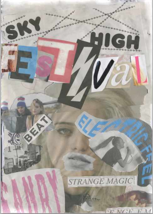
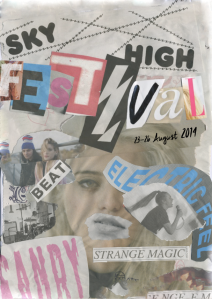
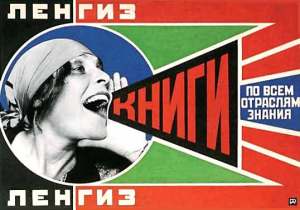
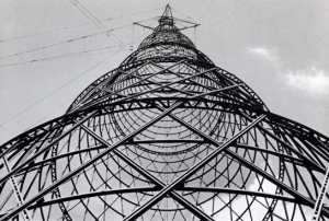
For my Dada poster I was inluenced by Hannah Hoch and Raul Haussmann. I liked how they used different elements to create their posters such as; photomontage, sketches etc. For my poster I picked up some free magazines from shops and from vintage stores. These magazines were usually music mbased or freelance designer based.The whole idea of my poster was to do with a poster for a festival. It was meant to be just a teaser poster to advertise the festival months in advance to get viewers enticed.
I noticed how in Hannah Hochs’ work she tore a lot of images etc out from newspapers or magazines from her time. To reperesent Dada I needed to do this to fro my poster, so using the free magazines I tore out images and words of dfferent fonts and laid them out on a piece of paper randomly so it reflected Dadism effectively. I also drew some random sketches or patterns etc over the images to reflect what Hannah Hoch did in her designs. After creating my design and sticking everything down, I scanned my poster in.
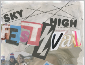
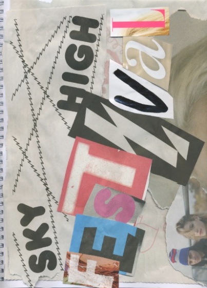 This was the first part of my poster I scanned in as it was an a4 scanner yet my poster was on an a3 sheet
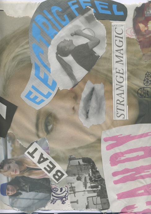 This was the second part of my a3 poster that I scanned in
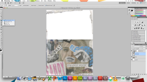
I opened an a3 photoshop document where I dropped both of the scanned images in. I placed the photos in the position that they were in my a3 sketchbook. I noticed that when the photos lined up, they was an obvious line in the middle where they were meant to join so I decided I would rotate the top photo to create more randomness in my photo and obscurity.
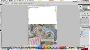 I noticed that on my poster the top of the poster showed the top of my sketchbook and affected the overall visual impact of the poster. I decided I would use the clone tool to patch up the top of the poster and proximity match with the clone tool. I selected a clone point from the poster and then cloned over the top of the poster which I didn’t like so much.
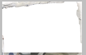 This is what the cloned layer looks like without the first part/layer of my poster switched on. As you can see it resembles elements from the image below, such as the lines and the paper.
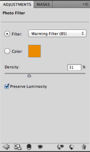
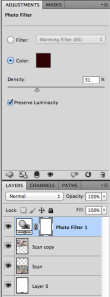 I then noticed in Dada posters they seemed to look very sepia or kind of coffee stained so I decided I would put a photo filter over my layers. I used a brown-red like colour which made it look kind of retro and sepia like but I was not very convinced with the colour so I changed the colour.
